
Wednesday, October 13, 2010
CS5 Layer Mask Tools Are Magical
I am in shock over this. They've seriously raised the bar with CS5.
Sunday, October 10, 2010
Protip: Photograph Artwork in Natural Light

These images were taken at different times, as you can see from the increased completeness of the drawing. The left one was taken indoors, the right one outdoors, under an awning on a sunny day. Neither has been retouched (except to crop them, etc) and use the exact same camera and settings. The difference is tremendous.

Cameras don’t perceive light the same way our eyes do. Our eyes have evolved to react intelligently and also have our brains working with them to improve our perceptions of the light that meets our eyes. My old Photography professor would harp on us that our eyes were poor judges of how much light is actually visible, and this is why.
Cameras are actually sort of dumb in comparison. The soft yellow light I have inside my house provides the camera with poor contrast and a yellow cast over the image.

Light from the sun is near optimal for photographing artwork. It is near unto white (with only a slight yellow shift as our sun is a “yellow” star) and bright enough for cameras to capture images without blurring from involuntary hand tremors, etc. The contrast is also better, straight off of the memory card as well.
Try to recreate my conditions in order to get results you’re happiest with:
- Shoot images outdoors
- Don’t shoot in direct sunlight to avoid glare and shadows
- Shoot on bright, sunny days
- Shoot artwork against contrasting background (non-reflecting black is best) for easier cropping later in PS
- Straighten crooked images in Photoshop or use a tri-pod to avoid shooting images skewed or in perspective
- Use double stick tape to lightly tack your drawings down to avoid the breeze ruining your shots
Images © 2010 the author, Eric Z Goodnight. Do not reuse under any circumstances without permission.
Thursday, September 9, 2010
Using the “Fill” Opacity to clean up Circles

As one of the last safeguards before a job goes to print, I’m often handed artwork that has craftmanship issues like the above public domain piece from NASA. Neither the customer nor the artist that used this as an element in a design noticed the spotty shadows that stuck out to me almost immediately as something that would print and likely look terrible. So, I took the element out and did a quick Photoshop treatment to improve the quality for the sake of the final print. Here’s a quick, dead-simple rundown of what I did.

Fortunately, I had all of the offending information on a single layer. Step one was simply finding this!
I could have used the eraser to take out the offending scum, but that would waste to much of my time. I hide the ring layer and opt to quickly create a much better outer ring myself.

I draw guides by clicking on the rulers on the top and sides of the image. If you don’t have your rulers enabled, toggle them with (Cmd + R).


I draw guides around the circle, basically drawing a box around it. This gives me a rough idea about where to start drawing my new circle.
Using the circular marquee tool (Shortcut M on your keyboard), I draw a perfect circle by holding shift and dragging the shape from one corner of my guide-box to the other, from upper left to bottom right.

I fill this circle with the same navy color and Edit>Fill. Still dead simple, right?

I right click (Opt+Click) the layer with my new circle on it and create a stroke the same navy color. My circle is roughly identical to the outside edge of the original art, just cleaner. The stroke effect allows me to draw the ring whatever size I want dynamically and precisely, as I can enter the exact number of pixels I need.

Here’s the real trick. With your circle drawn, we can decrease the “Fill” on our layers pallet to make the actual circle we just drew transparent, leaving behind the Stroke Layer effect we just created.
The Key difference is “Opacity” makes everything in the layer, including effects less opaque. When you use the Fill slider, only the non-effect information has it’s opacity changed!
Keep this in mind, as it can be very helpful to leave your shadows, bevel effects and strokes behind when you make your layer otherwise transparent.

Behold my new circle and the stroke around it! Notice the gap where the circle doesn’t quite touch the artwork. Let’s tend to that now.

Adjusting the stroke is as easy as going back to my layer and right clicking (Opt + Click) and going to my Stroke Layer effect. I thicken the stroke and go on about my business.

Not happy with my one stroke, I triple the layer by right clicking and picking duplicate. I go back to the stroke layer effect, and set each to a unique position. One is in the “Center” position, one is in the “Outside” position, and the last is on the inside position. This ensures I have no gaps in my ring, as well as giving me control over where each ring meets.
Coincidentally, my inner ring is thinner as to not collide with the text in the original artwork. The center ring covers the other two.
I select the three layers with Ctrl + Click (Cmd + Click) and press Ctrl + E to Merge them. This renders my layer effects and makes the three layers into one single one.

Much better. Without any trouble, I’ve taken out the scumming from the edge of the circle, and no one will ever be the wiser.

And here’s a shot of the final merged layer in the palette. The initial circle we drew was thrown out when we merged the layers earlier. Merging layers makes Photoshop render the layers together as close as it can to how you’re seeing them. Sometimes it doesn’t quite pull it off, but usually merging these layer effects goes smoothly.

For added cleanliness to my edge, I remove the anti-aliasing by setting my Blend Mode to “Dissolve.” These are fun to play with and can give you unexpected results if you use some of the more arcane (and often useless) ones.
Dissolve changes fields of smooth blend to hard pixel blends. Gradients will become diffused patterns of pixels that can simulate Photoshop’s truer gradients.

I prefer it because it gives me a hard edge that the Paint Bucket and Magic Wand have less trouble working with. Not exactly useful for everybody, however.

I create an empty layer with a quick Ctrl + Shift + N and merge the two of them. When you merge a layer with a Non-Default color mode, Photoshop will render the layer in the default mode.
Basically, if you want your layer mode to become “real,” you can merge it this way. If I hadn’t done this, my dissolve layer would not have been selectable as Photoshop would be using the original, untendered layer as it’s guide.
It’s a little tough to explain. Try it yourself with a few different layer modes to see the strange effects you get.
From there, I took it further by cleaning up the blues to match each other, and took the speckling out of the lighter colors. The finished product came out sharp, and I will show the results at a later time.
The Final Word: We’ve drawn guides to draw a more perfect circle around our art. We learned about using the “Fill” style opacity versus the “Regular Opacity.” From there, we created layer effects, and learned how to make them “real” layers by merging them. These are all simple but extremely helpful skills I often take for granted. Not really glamorous, but they can be applied to a lot of different situations without much adapting.
Monday, April 19, 2010
Demystifying Channels


The Square Marquee, Lasso and Wand tools are highlighted here.
Channels are essentially selections, the same as your Marquee tool (Shortcut "M" in your toolbox) or your Lasso tool (Shortcut "L" in your toolbox). When you draw a box, ellipse, or irregular shape with your Lasso or Wand, you're telling Photoshop you want it to pay attention to part of the active image area and ignore others. When you bring layers into this, it can get very complicated and potentially tough to understand, because you can have a selection go over several layers, but you can usually only draw an manipulate in one layer at a time.
Those selections are essentially a collection of Pixels, and a channel is a Grayscale representation of those pixels. (Grayscale is a limited color mode that only looks at 256 shades of gray, denoting value but no Hue or Saturation.)
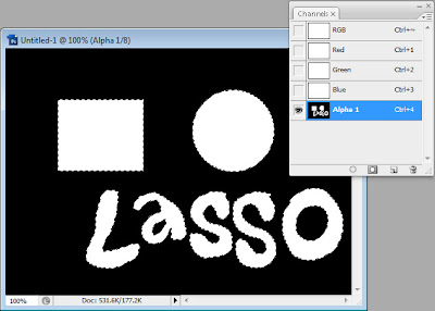
Channels are effectively painted representations of these selections. In the above demo image, I've taken my selections I created and painted them in as white in a new "Alpha Channel" in my channels palette. The white areas here represent the selected area, while the black ones represent the non-selected area.
This is built on a model of "Light-based" color spaces. RGB, you may recall, is based on combinations of Red, Green, and Blue lights to create pure white light. You don't really need to have a deep grasp of that to understand that the standard setting for Selections in Channels means that White is your selection, while Black represents emptiness. Like outer space, where there isn't white, there is black--no reflection of color.
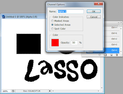
I personally can't stand working with Channels this way. I'm too hard wired to think of Black in terms of pigment, so I always switch my Channel's Default Setting to "Color Indicates Selected Areas." This sets your channels to react like CMYK, or Pigment-Based color spaces. Basically, the darker your image is in your channel, the more opaque, or solid, your selection is going to be.
I almost always work in RGB, but I prefer to work with my channels behaving as if they were Pigment-Based. This may sound odd, but you don't have to work this way at all if you don't want to. People work best with Photoshop when they're comfortable with it.

Red + Green + Blue builds up light and creates an image we can see and understand.
The RGB channels in your document are made the same way as these selections. They are Grayscale representations, except that Photoshop combines them to create the RGB values in your image.
In the Red Channel, areas that have a lot of red are represented with more white light. We can see some Red in the Blue LED, giving it a purple tint. We also see pure white in the Red LED, presumably because it's Red. It's a similar story in the Green and Blue Channels, with the brightest light going down respectively where the light is Green or Blue.
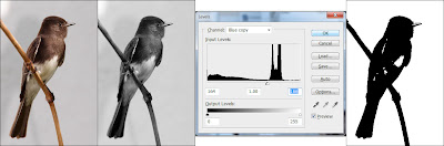
It can be helpful to keep in mind that Selections from the Marquees, Alpha Channels, and your Color Space Channels are the same kinds of thing. In this demo, I make a copy of my Blue Channel and radically adjust the Levels (Cmd + L), bringing Highlights up and Darks down, creating dramatic black and white contrast.
From there, I paint in the areas of speckle to get complete selection.
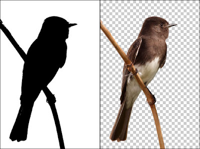
With this selection neatly painting in, I (Cmd + Click) my Alpha Channel, return to my Layers Pallette, and use "Layer via Cut" (Cmd + Shift+ J) and remove the bird from the background, neatly and in one painless step. This will oftentimes give you accurate cutouts that the Magic Eraser will not in a short space of time that you will not get with the regular Eraser tool.
The final word: As a Color Separator, I work extensively in Channels and I know the understanding you can get with experimenting with them. All images are essentially made of Channels, and Channels are glorified selections painted in a Grayscale Space. With this understanding and some zealous poking and prodding, you can get deep knowledge of Photoshop and do things you never thought possible.
Sunday, February 28, 2010
Filetypes in Photoshop
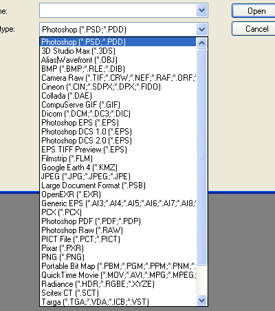
I'm constantly receiving artwork from clients that do not understand art files, and I doubt this will ever change. What an "art file" is, is either a Raster Image or a Vector Image, theoretically one of good enough quality to be produced. One of Photoshop's many strengths is the fact it can often handle ridiculous and exotic art files. Although many of these are the same, or at least incredibly similar, let's go over some of the more common ones and talk about what advantages they have, and briefly discuss what makes an appropriate art file.

PSD: This is the big one, y'all. PSD is the Photoshop file, proprietary to Adobe Software. Thankfully, it's not so proprietary that it's not become a standard for numerous graphics platforms. GIMP, which will run on nearly every platform of mainstream modern computing (Windows, Mac OS, and Linux) will open a PSD file without flinching. It will also keep track of the number one feature of a PSD file, Layers. Photoshop lives and dies by layers, as they allow you to build on top of your existing image without losing the information from the original. I have worked in non-layered Graphics programs. I promise you I will never return.
PSD files are Raster Graphics, meaning they're made of Pixels. However, since you have the ability to use layers, Photoshop files are considered "live" artwork, although it's quite possible to kill them by flattening the artwork inside Photoshop and saving them as PSD files.
Another potential problem with Photoshop is that newer versions may save in a file format that the older versions cannot work with. So if you're working with a graphics agency or print broker with an older copy of Photoshop, you'll need to learn to convert it to legacy formats.
It's also important to note that there's no magical benefit to PSD files. If you only have a JPG of your art, and your art person asks for a PSD, you can't fool her by converting the existing artwork to PSD. They could just as easily do that themselves, and it would be just as useless for everybody involved.
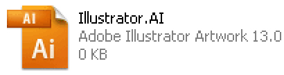
AI: Another important format, AI is the native illustrator file. Less ubiquitous than Photoshop, AI files aren't the norm except for graphics-oriented people. (Illustrator is, if you can believe it, perhaps less user friendly than Photoshop. It is, however, just as powerful for slightly different applications.) AI files are Vector Images, as opposed to Raster Images. Vectors are infinitely scalable, which means you can make a vector image at 2 inches square and print it on a billboard with no loss of quality. They're also incredibly small files since when you create shapes in illustrator, you're only creating the bare minimum information to recreate the artwork you're producing. (I could be more specific and say something dense like "Illustrator is reproducing your artwork dynamically, based on instructions you create with points, lines, gradients, and shapes," but it's out of scope for this article and will be covered at a later date.)
AI files can be imported into Photoshop easily, except that Photoshop Rasterizes them, or converts them into a Pixels. Once Vectors are rasterized, they can't be edited as Vectors without returning to the original file. Sounds complicated, doesn't it? I can demystify it later, just understand you can only sort-of transfer files back and forth from Illustrator and Photoshop.
Illustrator also handles fonts differently from Photoshop. If you move a PSD to a different computer and there's a font you used that the new machine doesn't have, your design will stay intact. Illustrator requires those fonts to dynamically rebuild your artwork upon opening. So if you move the file to a new machine, you're likely to run into trouble, and your design will change. However if you remember to select all of your fonts and "Outline" your fonts (Ctrl + Shift + O on Windows, Cmd + Shift + O on Mac) your fonts will no longer be editable and viewable on every computer with Illustrator or Photoshop.
Inkscape is a decent alternative to Illustrator, and a free open source download. If you're having trouble opening this filetype, Inkscape may help you.

PDF: Another Adobe format, there are dozens of PDF readers in the world, including the excellent program Preview for Mac OS X, and Foxit Reader for Windows. Adobe Acrobat is a weaker option for reading PDF files as it's bloated, slow, and the free version has important features locked out. Preview comes with Mac OS X, and Foxit Reader is a free download.
PDF files can be either Vector or Raster files. PDF is also a native Illustrator file, so you can save your high-end illustrator artwork as a PDF without losing any of your ability to open and edit your art. Photoshop and Illustrator will open either type without fail, although the Vector Type will open best in Illustrator, and you'll have more Raster editing options in Photoshop.
PDF is a great file format for printers because there's little to no problem with fonts defaulting and software to open, view, and print PDFs are readily available. Many printers, including FedEx Office, seem to prefer PDFs over more common filetypes like JPGs.

JPG:Best to get this one out of the way. JPGs are popular because they offer a smaller file size than other Raster files. They do not have the capability of layers, and worst of all, they are Lossy, meaning they lose quality when saved. They do this because they have a type of compression similar to the algorithmic compression of Zip archives or MP3 files, in that they find redundancies and throw away bits of quality in the image in order to keep file sizes down. This loss of quality will affect your artwork and cause noticable graininess or blurriness in your final product.
JPGs do have upsides. The small size has made them omnipresent on the internet, and every browser with graphic cabability will read them. They are very WYSIWYG (What You See Is What You Get). This means if you send somebody a JPG, you can be almost certain that there won't be any surprises with changed fonts or problems with legacy versions of Photoshop. JPG is a mature file format and you can be pretty sure even somebody with a 10 year old computer can open a JPG without trouble.

GIF: Compuserve GIF is an Indexed color-style file. This means that files saved as GIF have a palette of 256 pre-chosen colors and all pixels are limited to those colors. GIFs have some fancy, flashy features, like Animations and Transparency. But these are largely Web 1.0 era features--particularly Animation. There's not a lot of value to animated GIFs when you're printing T-Shirts or Business cards.
GIFs have relatively small file size, but don't have JPG style compression and loss of quality. The trade off is that they have their own loss of quality when the color palette is squeezed from 16.7 million colors into 256. Simply make sure you're happy with the look of your file before you send it off to be printed.
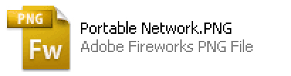
PNG: One of the lesser used files for printing, PNG was created to replace GIF files. It is an open standard and most modern web browsers should read it without trouble. It is lossless, and supports RGB and Index color modes. Most people do not save art files in PNG simply because it's not as accepted as other filetypes like JPG or GIF.
To this day, I have never been sent a PNG as artwork from a client. I may actually swoon from excitement when I am!

TIFF: These are a bit of an oddball of the bunch. TIFFs are large, lossless Raster Files that for some peculiar reason can be saved with Layers. I don't recommend saving layered files as TIFF, because it handles them clunkily, and your layered TIFF is likely to be extremely huge in comparison to a layered PSD file. Perfectly acceptable for a flattened file, but inferior as a layered file.

EPS: Another Adobe file format, EPS can either be live Vector or Raster images. Illustrator and Photoshop will read and write EPS. They are small and self-contained, and good documents for print. They are less common today, and PDF is likely a better option over EPS. Some printers, however, may prefer this filetype over others, so it is helpful to be aware of it.
Programs That DO NOT Make Artwork

Microsoft Word, Microsoft Publisher and Microsoft Powerpoint confuse most users into thinking they are making artwork. In reality, these are probably the worst things any user can create art for print in. Many print shops do not have versions of Powerpoint or Publisher, and none of these three create artwork in either a Vector or Raster style suitable for any sort of professional output.
I've seen clients send art over embedded in Word documents as clipart. This simply adds steps for resourceful artists to have to go through in order to print your artwork and adds no value to your work. You should use Microsoft Word when the important part of your document is the WORDS themselves, and not the layout, colors or graphics.
Publisher I have not ever used. I imagine it's a program similar to old Clipart style design programs like InstantArtist and PrintArtist from my youth. The proprietary publisher format of PUB is not useful to anyone without Microsoft Publisher. We have had to turn away more than one Client who had designed his art in Publisher and did not have the wherewithal to export it to a more useful type of artwork.
Microsoft Powerpoint has no application in the print world; it is simply a type of presentation software. I don't recommend using it for anything but presentations, and never for printing.
The final word: Apart from the Microsoft programs above, every filetype on this page should get you a decent result if your artwork is created at actual size, and at 300 DPI. If this confuses you, you can look at my article on Resolution to understand more about Dots Per Inch and creating a good file for print. It's all about getting yourself better results!
What's next? Learn about Resolution, or about Pixels.
All graphics for this entry created by me are available under Creative Commons Share Alike License. All Licensed graphics available through the CC and GNU licenses they fall under.
PSD: This is the big one, y'all. PSD is the Photoshop file, proprietary to Adobe Software. Thankfully, it's not so proprietary that it's not become a standard for numerous graphics platforms. GIMP, which will run on nearly every platform of mainstream modern computing (Windows, Mac OS, and Linux) will open a PSD file without flinching. It will also keep track of the number one feature of a PSD file, Layers. Photoshop lives and dies by layers, as they allow you to build on top of your existing image without losing the information from the original. I have worked in non-layered Graphics programs. I promise you I will never return.
PSD files are Raster Graphics, meaning they're made of Pixels. However, since you have the ability to use layers, Photoshop files are considered "live" artwork, although it's quite possible to kill them by flattening the artwork inside Photoshop and saving them as PSD files.
Another potential problem with Photoshop is that newer versions may save in a file format that the older versions cannot work with. So if you're working with a graphics agency or print broker with an older copy of Photoshop, you'll need to learn to convert it to legacy formats.
It's also important to note that there's no magical benefit to PSD files. If you only have a JPG of your art, and your art person asks for a PSD, you can't fool her by converting the existing artwork to PSD. They could just as easily do that themselves, and it would be just as useless for everybody involved.
AI: Another important format, AI is the native illustrator file. Less ubiquitous than Photoshop, AI files aren't the norm except for graphics-oriented people. (Illustrator is, if you can believe it, perhaps less user friendly than Photoshop. It is, however, just as powerful for slightly different applications.) AI files are Vector Images, as opposed to Raster Images. Vectors are infinitely scalable, which means you can make a vector image at 2 inches square and print it on a billboard with no loss of quality. They're also incredibly small files since when you create shapes in illustrator, you're only creating the bare minimum information to recreate the artwork you're producing. (I could be more specific and say something dense like "Illustrator is reproducing your artwork dynamically, based on instructions you create with points, lines, gradients, and shapes," but it's out of scope for this article and will be covered at a later date.)
AI files can be imported into Photoshop easily, except that Photoshop Rasterizes them, or converts them into a Pixels. Once Vectors are rasterized, they can't be edited as Vectors without returning to the original file. Sounds complicated, doesn't it? I can demystify it later, just understand you can only sort-of transfer files back and forth from Illustrator and Photoshop.
Illustrator also handles fonts differently from Photoshop. If you move a PSD to a different computer and there's a font you used that the new machine doesn't have, your design will stay intact. Illustrator requires those fonts to dynamically rebuild your artwork upon opening. So if you move the file to a new machine, you're likely to run into trouble, and your design will change. However if you remember to select all of your fonts and "Outline" your fonts (Ctrl + Shift + O on Windows, Cmd + Shift + O on Mac) your fonts will no longer be editable and viewable on every computer with Illustrator or Photoshop.
Inkscape is a decent alternative to Illustrator, and a free open source download. If you're having trouble opening this filetype, Inkscape may help you.
PDF: Another Adobe format, there are dozens of PDF readers in the world, including the excellent program Preview for Mac OS X, and Foxit Reader for Windows. Adobe Acrobat is a weaker option for reading PDF files as it's bloated, slow, and the free version has important features locked out. Preview comes with Mac OS X, and Foxit Reader is a free download.
PDF files can be either Vector or Raster files. PDF is also a native Illustrator file, so you can save your high-end illustrator artwork as a PDF without losing any of your ability to open and edit your art. Photoshop and Illustrator will open either type without fail, although the Vector Type will open best in Illustrator, and you'll have more Raster editing options in Photoshop.
PDF is a great file format for printers because there's little to no problem with fonts defaulting and software to open, view, and print PDFs are readily available. Many printers, including FedEx Office, seem to prefer PDFs over more common filetypes like JPGs.
JPG:Best to get this one out of the way. JPGs are popular because they offer a smaller file size than other Raster files. They do not have the capability of layers, and worst of all, they are Lossy, meaning they lose quality when saved. They do this because they have a type of compression similar to the algorithmic compression of Zip archives or MP3 files, in that they find redundancies and throw away bits of quality in the image in order to keep file sizes down. This loss of quality will affect your artwork and cause noticable graininess or blurriness in your final product.
JPGs do have upsides. The small size has made them omnipresent on the internet, and every browser with graphic cabability will read them. They are very WYSIWYG (What You See Is What You Get). This means if you send somebody a JPG, you can be almost certain that there won't be any surprises with changed fonts or problems with legacy versions of Photoshop. JPG is a mature file format and you can be pretty sure even somebody with a 10 year old computer can open a JPG without trouble.
GIF: Compuserve GIF is an Indexed color-style file. This means that files saved as GIF have a palette of 256 pre-chosen colors and all pixels are limited to those colors. GIFs have some fancy, flashy features, like Animations and Transparency. But these are largely Web 1.0 era features--particularly Animation. There's not a lot of value to animated GIFs when you're printing T-Shirts or Business cards.
GIFs have relatively small file size, but don't have JPG style compression and loss of quality. The trade off is that they have their own loss of quality when the color palette is squeezed from 16.7 million colors into 256. Simply make sure you're happy with the look of your file before you send it off to be printed.
PNG: One of the lesser used files for printing, PNG was created to replace GIF files. It is an open standard and most modern web browsers should read it without trouble. It is lossless, and supports RGB and Index color modes. Most people do not save art files in PNG simply because it's not as accepted as other filetypes like JPG or GIF.
To this day, I have never been sent a PNG as artwork from a client. I may actually swoon from excitement when I am!
TIFF: These are a bit of an oddball of the bunch. TIFFs are large, lossless Raster Files that for some peculiar reason can be saved with Layers. I don't recommend saving layered files as TIFF, because it handles them clunkily, and your layered TIFF is likely to be extremely huge in comparison to a layered PSD file. Perfectly acceptable for a flattened file, but inferior as a layered file.
EPS: Another Adobe file format, EPS can either be live Vector or Raster images. Illustrator and Photoshop will read and write EPS. They are small and self-contained, and good documents for print. They are less common today, and PDF is likely a better option over EPS. Some printers, however, may prefer this filetype over others, so it is helpful to be aware of it.
Programs That DO NOT Make Artwork
Microsoft Word, Microsoft Publisher and Microsoft Powerpoint confuse most users into thinking they are making artwork. In reality, these are probably the worst things any user can create art for print in. Many print shops do not have versions of Powerpoint or Publisher, and none of these three create artwork in either a Vector or Raster style suitable for any sort of professional output.
I've seen clients send art over embedded in Word documents as clipart. This simply adds steps for resourceful artists to have to go through in order to print your artwork and adds no value to your work. You should use Microsoft Word when the important part of your document is the WORDS themselves, and not the layout, colors or graphics.
Publisher I have not ever used. I imagine it's a program similar to old Clipart style design programs like InstantArtist and PrintArtist from my youth. The proprietary publisher format of PUB is not useful to anyone without Microsoft Publisher. We have had to turn away more than one Client who had designed his art in Publisher and did not have the wherewithal to export it to a more useful type of artwork.
Microsoft Powerpoint has no application in the print world; it is simply a type of presentation software. I don't recommend using it for anything but presentations, and never for printing.
The final word: Apart from the Microsoft programs above, every filetype on this page should get you a decent result if your artwork is created at actual size, and at 300 DPI. If this confuses you, you can look at my article on Resolution to understand more about Dots Per Inch and creating a good file for print. It's all about getting yourself better results!
What's next? Learn about Resolution, or about Pixels.
All graphics for this entry created by me are available under Creative Commons Share Alike License. All Licensed graphics available through the CC and GNU licenses they fall under.

Questions? I can help.

I'd like to encourage all of you that are interested to ask me your Photoshop and imaging questions. I'm extremely knowledgeable, and I'm willing to give you a hand.
Email me at understanding.photoshop@gmail.com and I'll get to work on helping you, answering your concerns, frustrations, and issues with Photoshop, as well as questions regarding images and other Adobe software.
Explaining Resolution: How dense is your image?
Image by clunky_wedding. Via Flickr.
When you're talking about any sort of image, it is generally good to think of it as having a purpose--your final intention of the image. Are you editing pictures of your wedding to print yourself? Are you making graphics for your website? Are you creating art for a shirt graphic? While we know Photoshop files are made of pixels, something often overlooked by Photoshop beginners is how many pixels the image has. One thing that will help you get a better final product is understanding a property of image files called Resolution, and tailoring it to your image's purpose.
Resolution is something I often have trouble explaining to clients. Just because an image looks about five or six inches on your screen doesn't mean it's going to look good when you fill an 8.5 x 11 inch piece of photo paper with it. The reason is likely because your file is low resolution.
It can help to think of old videogames when you think of resolution. Remember how blocky Mario used to be? That's because the NES was so limited in resolution that you could easily see the pixels. The NES had Low Resolution while newer video games are High Resolution, or High Definition, to use the television term. Pixels on televisions are no different than pixels on monitors, and not that different than dots printed on a page or T-Shirt.
This image is 72 DPI, and suitable for use on the web.
Image by Muhammmad Mahdi Karim. Via Wikipedia.
Low Resolution graphics are only good for your website and for looking at on the screen. Printing them out at actual size will give you visibly jagged images, or jaggies. Yes, that is a technical term. If you've ever downloaded a small image from a website and sent it to your printer, you'll see the results very clearly.
High Resolution images are suitable for various types of printing, including off your inkjet printer, on a poster, or on a T-Shirt. When you start with a good quality image, you have a better chance of getting a better result.
 Click to load the image fully, and you'll get a better idea of how better resolution helps.
My clients often send me their artwork at small sizes of 72 DPI and lower. This looks okay on the screen, but when you look at the file at the size it's going to be produced at, suddenly the artwork seems very poor. See how smooth and invisible the pixels on the first moth look? The second is the same 1 inch square of picture, but zoomed in on 72 DPI. That image would be okay if it was very small, like image above. But zoom in on 72 DPI and you have a jagged mess.
Photoshop can try and "Enhance" images by stretching them up to a larger size. But your result will never look as good as one with a 300 DPI source. This is the problem with working with low resolution. When I get art intended for T-Shirts, I'm often given pieces that look like the second image, and when I ask for better artwork, clients try and trick me and give me the "enhanced" version on the right. Just remember, Photoshop can't create information, it can only change what you give it. If you put bad information in, you'll get back a product of bad information. In this case, a bad quality image with smudgy edges. In professional art circles (as well as in other forms of using data, like programming) this principal is called Garbage In, Garbage Out (GIGO).
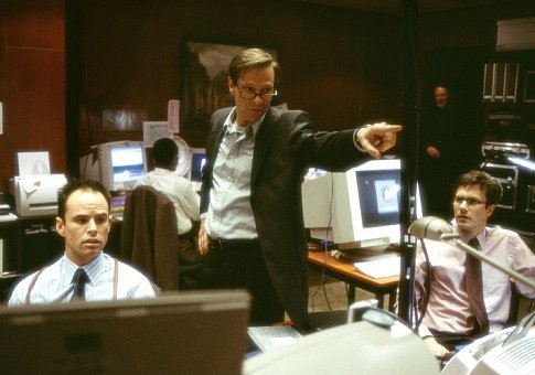
"Enhance it!" No, Chris Cooper, that's impossible.
From The Bourne Identity, used without permission;assumed fair use.
I often get irate when I see movies show a low quality image from a webcam or security camera, and the FBI director or whatever tells the computer jockey, "Enhance it!" Remember, what you put into an image is what you get out. If you start out with a smudgy face with no detail, if you "enhance," you'll get a blurry, smudgy face with no detail. It's impossible to add without an artist going in and making up details, all of which may be wrong. Artists can create information, but Photoshop cannot. The basic thing to learn here is unless computers learn to think and act creatively, you'll have to use high quality art to get good results. And despite what movies may tell us, we actually are quite a ways away from computers acting creatively.
The final word: If you're using a digital camera, use a high Megapixel setting and you will usually not have to think about resolution. But if you're making art in Photoshop, start with a resolution high enough for your final purpose. 300 DPI is a standard for much of the graphics industry. If you work at actual size (8" x 10" art for an 8" x 10" photo print) and start at 300 DPI, you'll find you consistently get a better product. Just remember, if you start with high resolution and shrink your image, you'll lose no quality. If you start with low resolution and blow up your image, or "enhance" it, you'll have tremendous quality loss.
What's next? Learn about about File Types, or about Pixels.
All graphics for this entry created by me are available under Creative Commons Share Alike License. All Licensed graphics available through the CC and GNU licenses they fall under.
Understanding Pixels: Location, Opacity, Color
Photoshop is a medium of Pixels, short for Picture Elements. Basically, when you fire up any version of Photoshop and open the pictures you want to edit, what you see and what the computer sees are not exactly the same thing. You see a picture of a Quarterback getting ready to snap a football; Photoshop sees thousands of dots lined up on a grid, each with individual properties.
Those dots are called Pixels. They make up one of the two kinds of computer images. This kind of image is called a Raster image, and Photoshop is called a Raster program because it deals largely with those images made from square dots. The other kind of image is a Vector image, and I'll talk about that another time.
Each of those dots have similar properties. When you open a picture, Photoshop reads a Location, Opacity, and Color for each of the thousands of pixels and renders them into something our eyes and brains can understand.
Let's go over these properties of pixels. Location is easy enough to understand. Photoshop puts everything on a 2D grid with X and Y coordinates. You don't have to refresh your algebra to understand it uses a grid of squares to keep track of where you want your pixels to go so it can put them there every single time. Once it knows where, it has to look at what Color and what Opacity each particular pixel is. Let's start with Opacity.
Past versions of Photoshop were the first image programs to introduce Layers, and as a consequence, Transparancy and Opacity. If the Opacity for some of your pixels is less than 100%, it is partly Transparent, and images below it in your layers will be affected by the transparent colors.
All layers in your Photoshop file have this same information: Color of dots, Location of dots, and Opacity of dots. It's important to keep these qualities in mind when you're working on your pictures because you can end up with a mess very quickly if you're working with a lot of layers. Opacity affects the color you see, not the color Photoshop sees. When Transparent colors overlap, they mix, showing you different colors. But if you still have the layers with transparent colors, the original color value is still there.
Notice how the colors blend, but the colors in my Layers Palette stay the same? That's how Opacity works throughout all of Photoshop, whether in the Layers Palette or with the Brush tool, or with other tools. You may see purple when red and blue blend transparently, but Photoshop sees two layers with lessened Opacity. The difference is that the colors remain separate entities, and can be returned to their original Opaque state.
Now on a more challenging topic--Color.
When you talk about color in Photoshop, you have to understand the computer doesn't know what "color" is. What it does "understand" pretty well is numbers. So, Photoshop keeps track of all the colors it has with numbers in different systems of Color Modes. These modes are RGB (for Red-Green-Blue), CMYK (for Cyan-Magenta-Yellow-blacK), Lab color(Lightness-a channel-b channel), and HSB (Hue-Saturation-Brightness). The two easiest to understand are RGB and CMYK, and they are also the most commonly used. For 99.9% of you, RGB will be the only thing you'll ever use or will need to use. I use Photoshop between six and ten hours a day and I rarely need anything outside of RGB for most of my purposes. Each has its own application, which I'll cover in another article, much later. For now, let's focus on RGB.
RGB is Photoshop's default color mode. Your monitor communicates to you through RGB because the so-called "primary colors" of light are Red, Green, and Blue. When these colors mix, you get pure white light, in Photoshop as well as in nature.
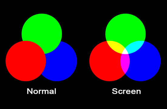
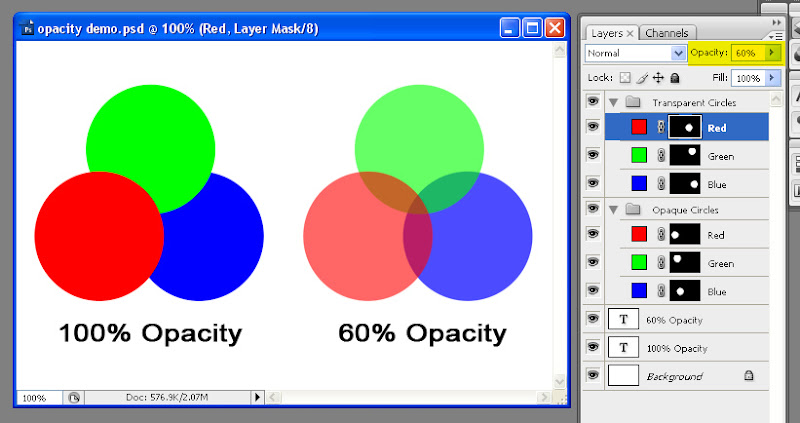
In this graphic, "Normal" represents Photoshop's Default Opaque layer effect. The "Screen" layer effect represents what that same color looks like as if it was light being cast--the brighter the color, the more opaque it appears. Red, Green, and Blue combine here to create white in the center. Red and Green combine to create Yellow, Blue and Red create Magenta, Green and Blue create Cyan.
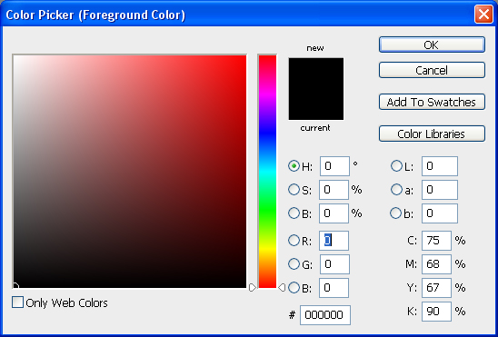
These colors are represented by numbers in the corresponding channels, from zero to 255, a range of 256 options. Black has an RGB value of 0,0,0. White has an RGB value of 255, 255, 255. Any true gray is created by equal amounts of RGB, say 100, 100, 100. Pure red is 255, 0, 0. Likewise, pure Green is 0,255,0, and Blue is 0,0,255. Keep in mind we may not think of "Pure" Red, Green, and Blue looking like what Photoshop considers pure Red, Green, and Blue. But these are its primary colors, and as pure as you can get.
There are, of course, all manner of colors that are outside of the scope of this very narrow range of colors Photoshop can represent. This range of color is called a Gamut, which you can think of as a sort of box that contains the colors you can use--sort of like a box of crayons. But your monitor and printer can only represent a very limited number of the infinite subtlety of colors available in nature. But for our purposes, we have a palette of about 16.7 million colors to work with, with the rest of infinite spectrum of colors resting where we call Out of Gamut.
The final word:You do not need to understand all the subtleties of the various color modes to begin to use them, but dissecting RGB this way can begin to make Photoshop less overwhelming, and that is ultimately my goal for you. These principals, by the way, also apply to other Raster programs, like MS Paint, The GIMP, or CorelDraw. Until engineers come up with a better model for rendering colors, this is the standard we'll continue to work within. The important information to remember is that Raster Images are made of pixels, and pixels have three basic kinds of information attributed to them (Location, Opacity, and Color). Photoshop's default Color Mode is RGB, which I explained, but you don't need to have a deep grasp of--just understand it's basically limited colors tracked by numbers.
What's next? Learn about Resolution, or about File Types.
All graphics for this entry created by me are available under Creative Commons Share Alike License. All Licensed graphics available through the CC and GNU licenses they fall under.
Subscribe to:
Posts (Atom)


