I'm constantly receiving artwork from clients that do not understand art files, and I doubt this will ever change. What an "art file" is, is either a Raster Image or a Vector Image, theoretically one of good enough quality to be produced. One of Photoshop's many strengths is the fact it can often handle ridiculous and exotic art files. Although many of these are the same, or at least incredibly similar, let's go over some of the more common ones and talk about what advantages they have, and briefly discuss what makes an appropriate art file.

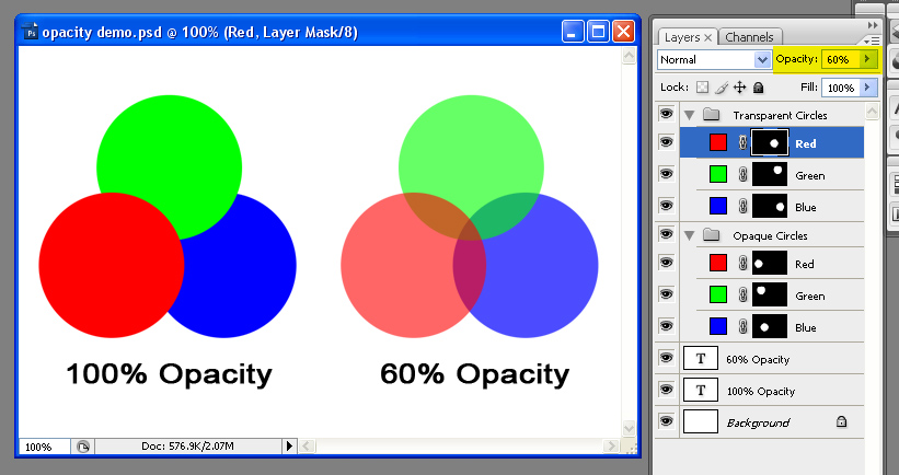
PSD: This is the big one, y'all. PSD is the Photoshop file, proprietary to Adobe Software. Thankfully, it's not so proprietary that it's not become a standard for numerous graphics platforms. GIMP, which will run on nearly every platform of mainstream modern computing (Windows, Mac OS, and Linux) will open a PSD file without flinching. It will also keep track of the number one feature of a PSD file, Layers. Photoshop lives and dies by layers, as they allow you to build on top of your existing image without losing the information from the original. I have worked in non-layered Graphics programs. I promise you I will never return.
PSD files are Raster Graphics, meaning they're made of Pixels. However, since you have the ability to use layers, Photoshop files are considered "live" artwork, although it's quite possible to kill them by flattening the artwork inside Photoshop and saving them as PSD files.
Another potential problem with Photoshop is that newer versions may save in a file format that the older versions cannot work with. So if you're working with a graphics agency or print broker with an older copy of Photoshop, you'll need to learn to convert it to legacy formats.
It's also important to note that there's no magical benefit to PSD files. If you only have a JPG of your art, and your art person asks for a PSD, you can't fool her by converting the existing artwork to PSD. They could just as easily do that themselves, and it would be just as useless for everybody involved.

AI: Another important format, AI is the native illustrator file. Less ubiquitous than Photoshop, AI files aren't the norm except for graphics-oriented people. (Illustrator is, if you can believe it, perhaps less user friendly than Photoshop. It is, however, just as powerful for slightly different applications.) AI files are Vector Images, as opposed to Raster Images. Vectors are infinitely scalable, which means you can make a vector image at 2 inches square and print it on a billboard with no loss of quality. They're also incredibly small files since when you create shapes in illustrator, you're only creating the bare minimum information to recreate the artwork you're producing. (I could be more specific and say something dense like "Illustrator is reproducing your artwork dynamically, based on instructions you create with points, lines, gradients, and shapes," but it's out of scope for this article and will be covered at a later date.)
AI files can be imported into Photoshop easily, except that Photoshop Rasterizes them, or converts them into a Pixels. Once Vectors are rasterized, they can't be edited as Vectors without returning to the original file. Sounds complicated, doesn't it? I can demystify it later, just understand you can only sort-of transfer files back and forth from Illustrator and Photoshop.
Illustrator also handles fonts differently from Photoshop. If you move a PSD to a different computer and there's a font you used that the new machine doesn't have, your design will stay intact. Illustrator requires those fonts to dynamically rebuild your artwork upon opening. So if you move the file to a new machine, you're likely to run into trouble, and your design will change. However if you remember to select all of your fonts and "Outline" your fonts (Ctrl + Shift + O on Windows, Cmd + Shift + O on Mac) your fonts will no longer be editable and viewable on every computer with Illustrator or Photoshop.
Inkscape is a decent alternative to Illustrator, and a free open source download. If you're having trouble opening this filetype, Inkscape may help you.

PDF: Another Adobe format, there are dozens of PDF readers in the world, including the excellent program Preview for Mac OS X, and Foxit Reader for Windows. Adobe Acrobat is a weaker option for reading PDF files as it's bloated, slow, and the free version has important features locked out. Preview comes with Mac OS X, and Foxit Reader is a free download.
PDF files can be either Vector or Raster files. PDF is also a native Illustrator file, so you can save your high-end illustrator artwork as a PDF without losing any of your ability to open and edit your art. Photoshop and Illustrator will open either type without fail, although the Vector Type will open best in Illustrator, and you'll have more Raster editing options in Photoshop.
PDF is a great file format for printers because there's little to no problem with fonts defaulting and software to open, view, and print PDFs are readily available. Many printers, including FedEx Office, seem to prefer PDFs over more common filetypes like JPGs.

JPG:Best to get this one out of the way. JPGs are popular because they offer a smaller file size than other Raster files. They do not have the capability of layers, and worst of all, they are Lossy, meaning they lose quality when saved. They do this because they have a type of compression similar to the algorithmic compression of Zip archives or MP3 files, in that they find redundancies and throw away bits of quality in the image in order to keep file sizes down. This loss of quality will affect your artwork and cause noticable graininess or blurriness in your final product.
JPGs do have upsides. The small size has made them omnipresent on the internet, and every browser with graphic cabability will read them. They are very WYSIWYG (What You See Is What You Get). This means if you send somebody a JPG, you can be almost certain that there won't be any surprises with changed fonts or problems with legacy versions of Photoshop. JPG is a mature file format and you can be pretty sure even somebody with a 10 year old computer can open a JPG without trouble.

GIF: Compuserve GIF is an Indexed color-style file. This means that files saved as GIF have a palette of 256 pre-chosen colors and all pixels are limited to those colors. GIFs have some fancy, flashy features, like Animations and Transparency. But these are largely Web 1.0 era features--particularly Animation. There's not a lot of value to animated GIFs when you're printing T-Shirts or Business cards.
GIFs have relatively small file size, but don't have JPG style compression and loss of quality. The trade off is that they have their own loss of quality when the color palette is squeezed from 16.7 million colors into 256. Simply make sure you're happy with the look of your file before you send it off to be printed.

PNG: One of the lesser used files for printing, PNG was created to replace GIF files. It is an open standard and most modern web browsers should read it without trouble. It is lossless, and supports RGB and Index color modes. Most people do not save art files in PNG simply because it's not as accepted as other filetypes like JPG or GIF.
To this day, I have never been sent a PNG as artwork from a client. I may actually swoon from excitement when I am!

TIFF: These are a bit of an oddball of the bunch. TIFFs are large, lossless Raster Files that for some peculiar reason can be saved with Layers. I don't recommend saving layered files as TIFF, because it handles them clunkily, and your layered TIFF is likely to be extremely huge in comparison to a layered PSD file. Perfectly acceptable for a flattened file, but inferior as a layered file.

EPS: Another Adobe file format, EPS can either be live Vector or Raster images. Illustrator and Photoshop will read and write EPS. They are small and self-contained, and good documents for print. They are less common today, and PDF is likely a better option over EPS. Some printers, however, may prefer this filetype over others, so it is helpful to be aware of it.
Programs That DO NOT Make Artwork
Microsoft Word, Microsoft Publisher and Microsoft Powerpoint confuse most users into thinking they are making artwork. In reality, these are probably the worst things any user can create art for print in. Many print shops do not have versions of Powerpoint or Publisher, and none of these three create artwork in either a Vector or Raster style suitable for any sort of professional output.
I've seen clients send art over embedded in Word documents as clipart. This simply adds steps for resourceful artists to have to go through in order to print your artwork and adds no value to your work. You should use Microsoft Word when the important part of your document is the WORDS themselves, and not the layout, colors or graphics.
Publisher I have not ever used. I imagine it's a program similar to old Clipart style design programs like InstantArtist and PrintArtist from my youth. The proprietary publisher format of PUB is not useful to anyone without Microsoft Publisher. We have had to turn away more than one Client who had designed his art in Publisher and did not have the wherewithal to export it to a more useful type of artwork.
Microsoft Powerpoint has no application in the print world; it is simply a type of presentation software. I don't recommend using it for anything but presentations, and never for printing.
The final word: Apart from the Microsoft programs above, every filetype on this page should get you a decent result if your artwork is created at actual size, and at 300 DPI. If this confuses you, you can look at my article on Resolution to understand more about Dots Per Inch and creating a good file for print. It's all about getting yourself better results!
What's next? Learn about Resolution, or about Pixels.
All graphics for this entry created by me are available under Creative Commons Share Alike License. All Licensed graphics available through the CC and GNU licenses they fall under.

PSD: This is the big one, y'all. PSD is the Photoshop file, proprietary to Adobe Software. Thankfully, it's not so proprietary that it's not become a standard for numerous graphics platforms. GIMP, which will run on nearly every platform of mainstream modern computing (Windows, Mac OS, and Linux) will open a PSD file without flinching. It will also keep track of the number one feature of a PSD file, Layers. Photoshop lives and dies by layers, as they allow you to build on top of your existing image without losing the information from the original. I have worked in non-layered Graphics programs. I promise you I will never return.
PSD files are Raster Graphics, meaning they're made of Pixels. However, since you have the ability to use layers, Photoshop files are considered "live" artwork, although it's quite possible to kill them by flattening the artwork inside Photoshop and saving them as PSD files.
Another potential problem with Photoshop is that newer versions may save in a file format that the older versions cannot work with. So if you're working with a graphics agency or print broker with an older copy of Photoshop, you'll need to learn to convert it to legacy formats.
It's also important to note that there's no magical benefit to PSD files. If you only have a JPG of your art, and your art person asks for a PSD, you can't fool her by converting the existing artwork to PSD. They could just as easily do that themselves, and it would be just as useless for everybody involved.

AI: Another important format, AI is the native illustrator file. Less ubiquitous than Photoshop, AI files aren't the norm except for graphics-oriented people. (Illustrator is, if you can believe it, perhaps less user friendly than Photoshop. It is, however, just as powerful for slightly different applications.) AI files are Vector Images, as opposed to Raster Images. Vectors are infinitely scalable, which means you can make a vector image at 2 inches square and print it on a billboard with no loss of quality. They're also incredibly small files since when you create shapes in illustrator, you're only creating the bare minimum information to recreate the artwork you're producing. (I could be more specific and say something dense like "Illustrator is reproducing your artwork dynamically, based on instructions you create with points, lines, gradients, and shapes," but it's out of scope for this article and will be covered at a later date.)
AI files can be imported into Photoshop easily, except that Photoshop Rasterizes them, or converts them into a Pixels. Once Vectors are rasterized, they can't be edited as Vectors without returning to the original file. Sounds complicated, doesn't it? I can demystify it later, just understand you can only sort-of transfer files back and forth from Illustrator and Photoshop.
Illustrator also handles fonts differently from Photoshop. If you move a PSD to a different computer and there's a font you used that the new machine doesn't have, your design will stay intact. Illustrator requires those fonts to dynamically rebuild your artwork upon opening. So if you move the file to a new machine, you're likely to run into trouble, and your design will change. However if you remember to select all of your fonts and "Outline" your fonts (Ctrl + Shift + O on Windows, Cmd + Shift + O on Mac) your fonts will no longer be editable and viewable on every computer with Illustrator or Photoshop.
Inkscape is a decent alternative to Illustrator, and a free open source download. If you're having trouble opening this filetype, Inkscape may help you.

PDF: Another Adobe format, there are dozens of PDF readers in the world, including the excellent program Preview for Mac OS X, and Foxit Reader for Windows. Adobe Acrobat is a weaker option for reading PDF files as it's bloated, slow, and the free version has important features locked out. Preview comes with Mac OS X, and Foxit Reader is a free download.
PDF files can be either Vector or Raster files. PDF is also a native Illustrator file, so you can save your high-end illustrator artwork as a PDF without losing any of your ability to open and edit your art. Photoshop and Illustrator will open either type without fail, although the Vector Type will open best in Illustrator, and you'll have more Raster editing options in Photoshop.
PDF is a great file format for printers because there's little to no problem with fonts defaulting and software to open, view, and print PDFs are readily available. Many printers, including FedEx Office, seem to prefer PDFs over more common filetypes like JPGs.

JPG:Best to get this one out of the way. JPGs are popular because they offer a smaller file size than other Raster files. They do not have the capability of layers, and worst of all, they are Lossy, meaning they lose quality when saved. They do this because they have a type of compression similar to the algorithmic compression of Zip archives or MP3 files, in that they find redundancies and throw away bits of quality in the image in order to keep file sizes down. This loss of quality will affect your artwork and cause noticable graininess or blurriness in your final product.
JPGs do have upsides. The small size has made them omnipresent on the internet, and every browser with graphic cabability will read them. They are very WYSIWYG (What You See Is What You Get). This means if you send somebody a JPG, you can be almost certain that there won't be any surprises with changed fonts or problems with legacy versions of Photoshop. JPG is a mature file format and you can be pretty sure even somebody with a 10 year old computer can open a JPG without trouble.

GIF: Compuserve GIF is an Indexed color-style file. This means that files saved as GIF have a palette of 256 pre-chosen colors and all pixels are limited to those colors. GIFs have some fancy, flashy features, like Animations and Transparency. But these are largely Web 1.0 era features--particularly Animation. There's not a lot of value to animated GIFs when you're printing T-Shirts or Business cards.
GIFs have relatively small file size, but don't have JPG style compression and loss of quality. The trade off is that they have their own loss of quality when the color palette is squeezed from 16.7 million colors into 256. Simply make sure you're happy with the look of your file before you send it off to be printed.

PNG: One of the lesser used files for printing, PNG was created to replace GIF files. It is an open standard and most modern web browsers should read it without trouble. It is lossless, and supports RGB and Index color modes. Most people do not save art files in PNG simply because it's not as accepted as other filetypes like JPG or GIF.
To this day, I have never been sent a PNG as artwork from a client. I may actually swoon from excitement when I am!

TIFF: These are a bit of an oddball of the bunch. TIFFs are large, lossless Raster Files that for some peculiar reason can be saved with Layers. I don't recommend saving layered files as TIFF, because it handles them clunkily, and your layered TIFF is likely to be extremely huge in comparison to a layered PSD file. Perfectly acceptable for a flattened file, but inferior as a layered file.

EPS: Another Adobe file format, EPS can either be live Vector or Raster images. Illustrator and Photoshop will read and write EPS. They are small and self-contained, and good documents for print. They are less common today, and PDF is likely a better option over EPS. Some printers, however, may prefer this filetype over others, so it is helpful to be aware of it.
Programs That DO NOT Make Artwork

Microsoft Word, Microsoft Publisher and Microsoft Powerpoint confuse most users into thinking they are making artwork. In reality, these are probably the worst things any user can create art for print in. Many print shops do not have versions of Powerpoint or Publisher, and none of these three create artwork in either a Vector or Raster style suitable for any sort of professional output.
I've seen clients send art over embedded in Word documents as clipart. This simply adds steps for resourceful artists to have to go through in order to print your artwork and adds no value to your work. You should use Microsoft Word when the important part of your document is the WORDS themselves, and not the layout, colors or graphics.
Publisher I have not ever used. I imagine it's a program similar to old Clipart style design programs like InstantArtist and PrintArtist from my youth. The proprietary publisher format of PUB is not useful to anyone without Microsoft Publisher. We have had to turn away more than one Client who had designed his art in Publisher and did not have the wherewithal to export it to a more useful type of artwork.
Microsoft Powerpoint has no application in the print world; it is simply a type of presentation software. I don't recommend using it for anything but presentations, and never for printing.
The final word: Apart from the Microsoft programs above, every filetype on this page should get you a decent result if your artwork is created at actual size, and at 300 DPI. If this confuses you, you can look at my article on Resolution to understand more about Dots Per Inch and creating a good file for print. It's all about getting yourself better results!
What's next? Learn about Resolution, or about Pixels.
All graphics for this entry created by me are available under Creative Commons Share Alike License. All Licensed graphics available through the CC and GNU licenses they fall under.


