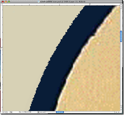
As one of the last safeguards before a job goes to print, I’m often handed artwork that has craftmanship issues like the above public domain piece from NASA. Neither the customer nor the artist that used this as an element in a design noticed the spotty shadows that stuck out to me almost immediately as something that would print and likely look terrible. So, I took the element out and did a quick Photoshop treatment to improve the quality for the sake of the final print. Here’s a quick, dead-simple rundown of what I did.

Fortunately, I had all of the offending information on a single layer. Step one was simply finding this!
I could have used the eraser to take out the offending scum, but that would waste to much of my time. I hide the ring layer and opt to quickly create a much better outer ring myself.

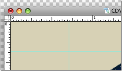
I draw guides by clicking on the rulers on the top and sides of the image. If you don’t have your rulers enabled, toggle them with (Cmd + R).


I draw guides around the circle, basically drawing a box around it. This gives me a rough idea about where to start drawing my new circle.
Using the circular marquee tool (Shortcut M on your keyboard), I draw a perfect circle by holding shift and dragging the shape from one corner of my guide-box to the other, from upper left to bottom right.

I fill this circle with the same navy color and Edit>Fill. Still dead simple, right?

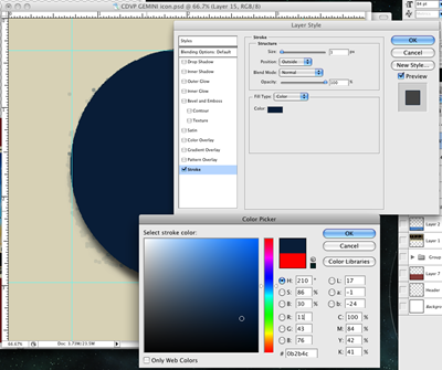
I right click (Opt+Click) the layer with my new circle on it and create a stroke the same navy color. My circle is roughly identical to the outside edge of the original art, just cleaner. The stroke effect allows me to draw the ring whatever size I want dynamically and precisely, as I can enter the exact number of pixels I need.

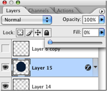
Here’s the real trick. With your circle drawn, we can decrease the “Fill” on our layers pallet to make the actual circle we just drew transparent, leaving behind the Stroke Layer effect we just created.
The Key difference is “Opacity” makes everything in the layer, including effects less opaque. When you use the Fill slider, only the non-effect information has it’s opacity changed!
Keep this in mind, as it can be very helpful to leave your shadows, bevel effects and strokes behind when you make your layer otherwise transparent.

Behold my new circle and the stroke around it! Notice the gap where the circle doesn’t quite touch the artwork. Let’s tend to that now.

Adjusting the stroke is as easy as going back to my layer and right clicking (Opt + Click) and going to my Stroke Layer effect. I thicken the stroke and go on about my business.
Not happy with my one stroke, I triple the layer by right clicking and picking duplicate. I go back to the stroke layer effect, and set each to a unique position. One is in the “Center” position, one is in the “Outside” position, and the last is on the inside position. This ensures I have no gaps in my ring, as well as giving me control over where each ring meets.
Coincidentally, my inner ring is thinner as to not collide with the text in the original artwork. The center ring covers the other two.
I select the three layers with Ctrl + Click (Cmd + Click) and press Ctrl + E to Merge them. This renders my layer effects and makes the three layers into one single one.

Much better. Without any trouble, I’ve taken out the scumming from the edge of the circle, and no one will ever be the wiser.

And here’s a shot of the final merged layer in the palette. The initial circle we drew was thrown out when we merged the layers earlier. Merging layers makes Photoshop render the layers together as close as it can to how you’re seeing them. Sometimes it doesn’t quite pull it off, but usually merging these layer effects goes smoothly.

For added cleanliness to my edge, I remove the anti-aliasing by setting my Blend Mode to “Dissolve.” These are fun to play with and can give you unexpected results if you use some of the more arcane (and often useless) ones.
Dissolve changes fields of smooth blend to hard pixel blends. Gradients will become diffused patterns of pixels that can simulate Photoshop’s truer gradients.

I prefer it because it gives me a hard edge that the Paint Bucket and Magic Wand have less trouble working with. Not exactly useful for everybody, however.

I create an empty layer with a quick Ctrl + Shift + N and merge the two of them. When you merge a layer with a Non-Default color mode, Photoshop will render the layer in the default mode.
Basically, if you want your layer mode to become “real,” you can merge it this way. If I hadn’t done this, my dissolve layer would not have been selectable as Photoshop would be using the original, untendered layer as it’s guide.
It’s a little tough to explain. Try it yourself with a few different layer modes to see the strange effects you get.

From there, I took it further by cleaning up the blues to match each other, and took the speckling out of the lighter colors. The finished product came out sharp, and I will show the results at a later time.
The Final Word: We’ve drawn guides to draw a more perfect circle around our art. We learned about using the “Fill” style opacity versus the “Regular Opacity.” From there, we created layer effects, and learned how to make them “real” layers by merging them. These are all simple but extremely helpful skills I often take for granted. Not really glamorous, but they can be applied to a lot of different situations without much adapting.


